I've talked about this before, but not written it down.
One of the criticisms of tags is that they are 'just keywords again', which is true. The key difference is that they are experienced differently by the users, in a way that imposes much less cognitive load.
iPhoto has had an image keywords feature since it was first launched, but I don't know anyone who uses it. Conversely, Flickr's tagging is used by most of its users.
Part of this is down to the effect of working in public rather than private, as discussed in another context in Cory's classic 'outboard brain' essay, where the sense of public performance changes the psychology of annotation.
 But a key part of it is the cognitive load of the user interface.
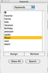
With iPhoto, in order to tag something, you need to first dig around in the menubar to bring up the Keywords dialog, illustrated here.
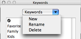
Then you need to create a new Keyword (which is buried under the popup at the top).
Then you need to select the photos that you want to tag with that keyword in the main window, then go back to the Keywords window and click 'Assign'.
This is not just a four-stage process, it has 2 stages that impose a big cognitive load, of the kind Cory describes as
one of those get-to-it-later eat-your-vegetables best-practice housekeeping tasks like defragging your hard drive or squeegeeing your windshield that you know you should do but never get around to.
 Being handed a list of keywords and asked to add your desired ones is in effect asking you to construct a personal ontology of the world; to break the world into categories you want to keep track of. To hold the entire universe in your head in one go, and chop it into meaningful chunks. That's too mentally exhausting for most people. Plus, as creating a keyword is a 2-stage process, it feels a bit like they are rationed.
Then, the implied second task is to go and find all the pictures you have taken that fit that keyword. Again, this involves scanning through possibly thousands of images looking for the right one.
Now these aren't actual constraints; you can just create one tag and apply it to one photo, but the process makes it feel like a big deal, and something that you should consider carefully before doing it. So hardly anyone does it.
Conversely, Flickr prompts you for tags for each batch of photos you upload, and shows you each individual photo with a place to type tags in next to it. You look at the picture and type in the few words it makes you think of, move on to the next, and you're done. The cognitive load is tiny, because you have the picture in front of you and you can't help but think of words to describe it.
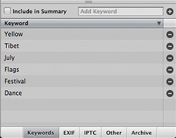
 Aperture, Apple's new application for professional photographers, seems to have come up with a better solution than iPhoto. It has a pane in the general photo view that lets you freely enter keywords (one at a time, by the look of it, but I assume they go into the list below as you do so). However, the list of tech specs includes a long list of predefined tags. This is puzzling - why do they feel the need to list tags for 'Bridesmaid' and 'Groomsman' and so on as a feature?
Technorati Tags: Aperture, iPhoto, keywords, ontology, photography, tagcamp, tags, taxonomy
